
Where to find us
Featured collection
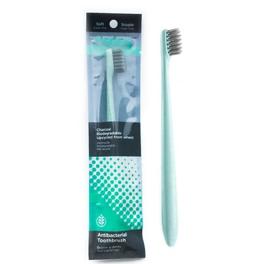
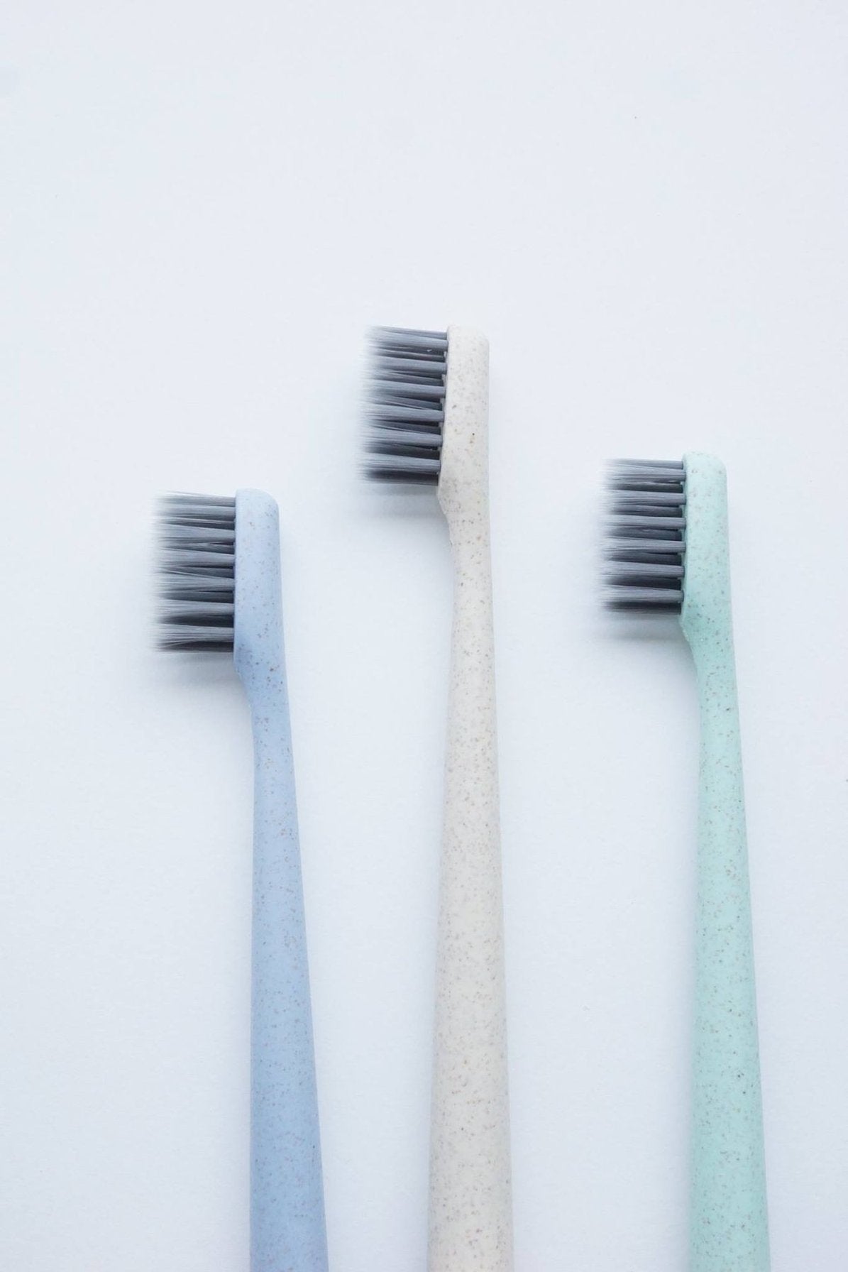
Skin, Bath & Home
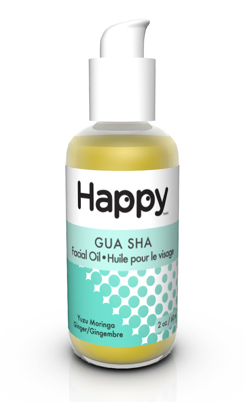
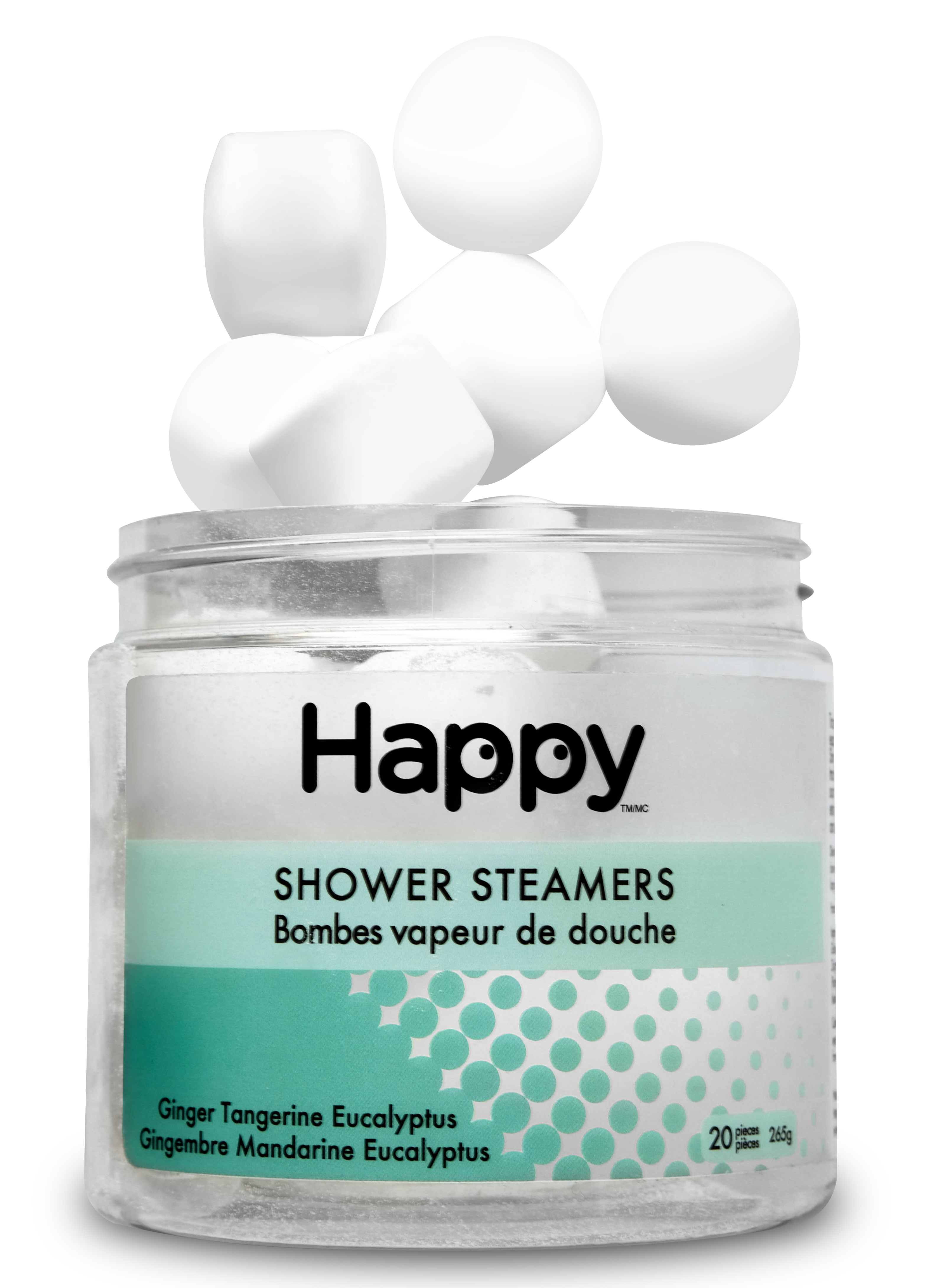
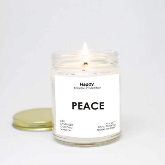
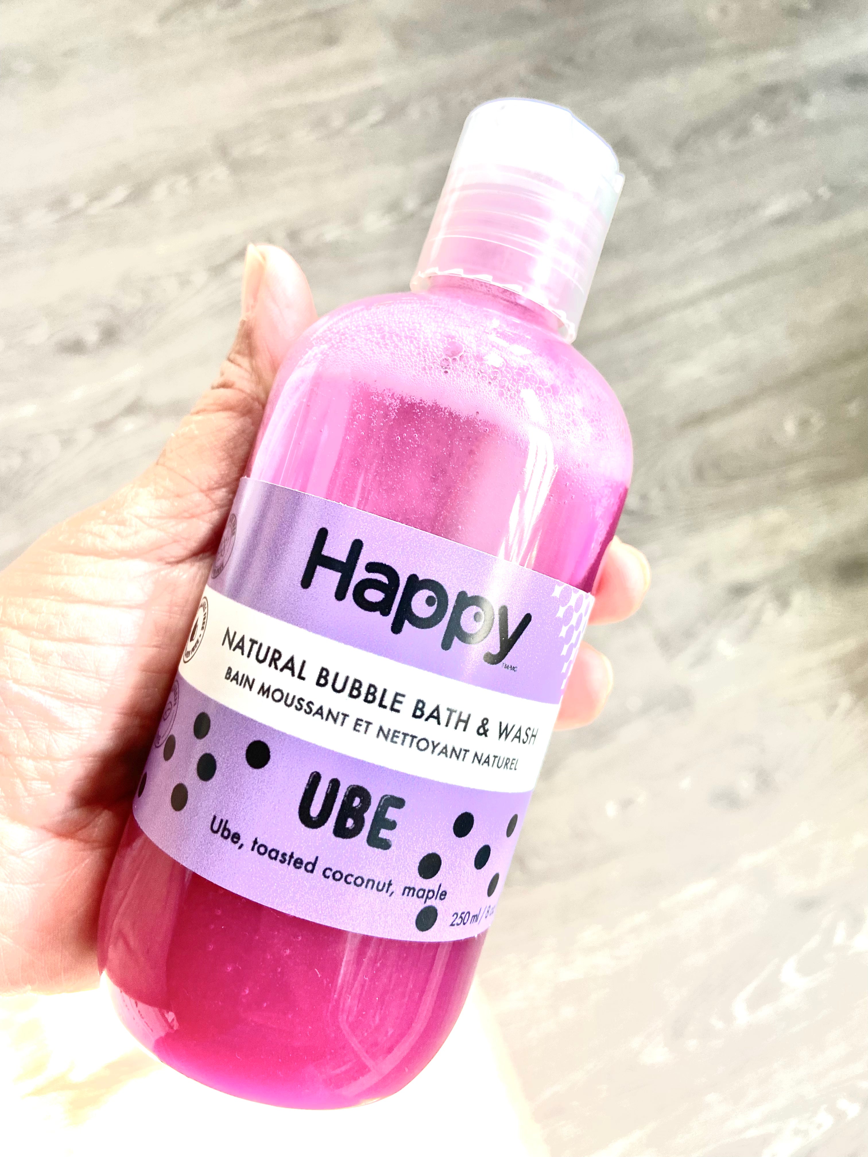


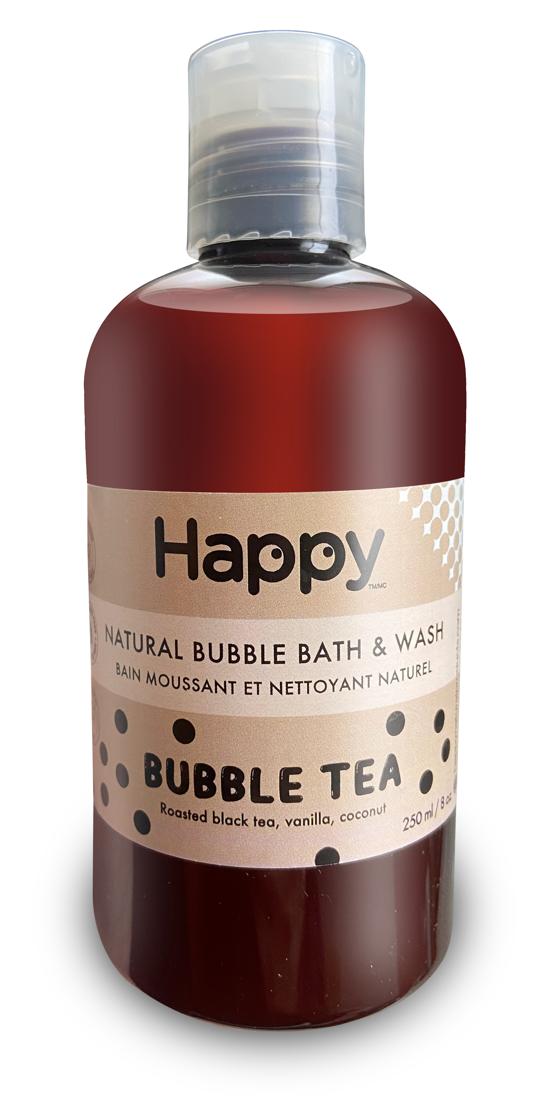
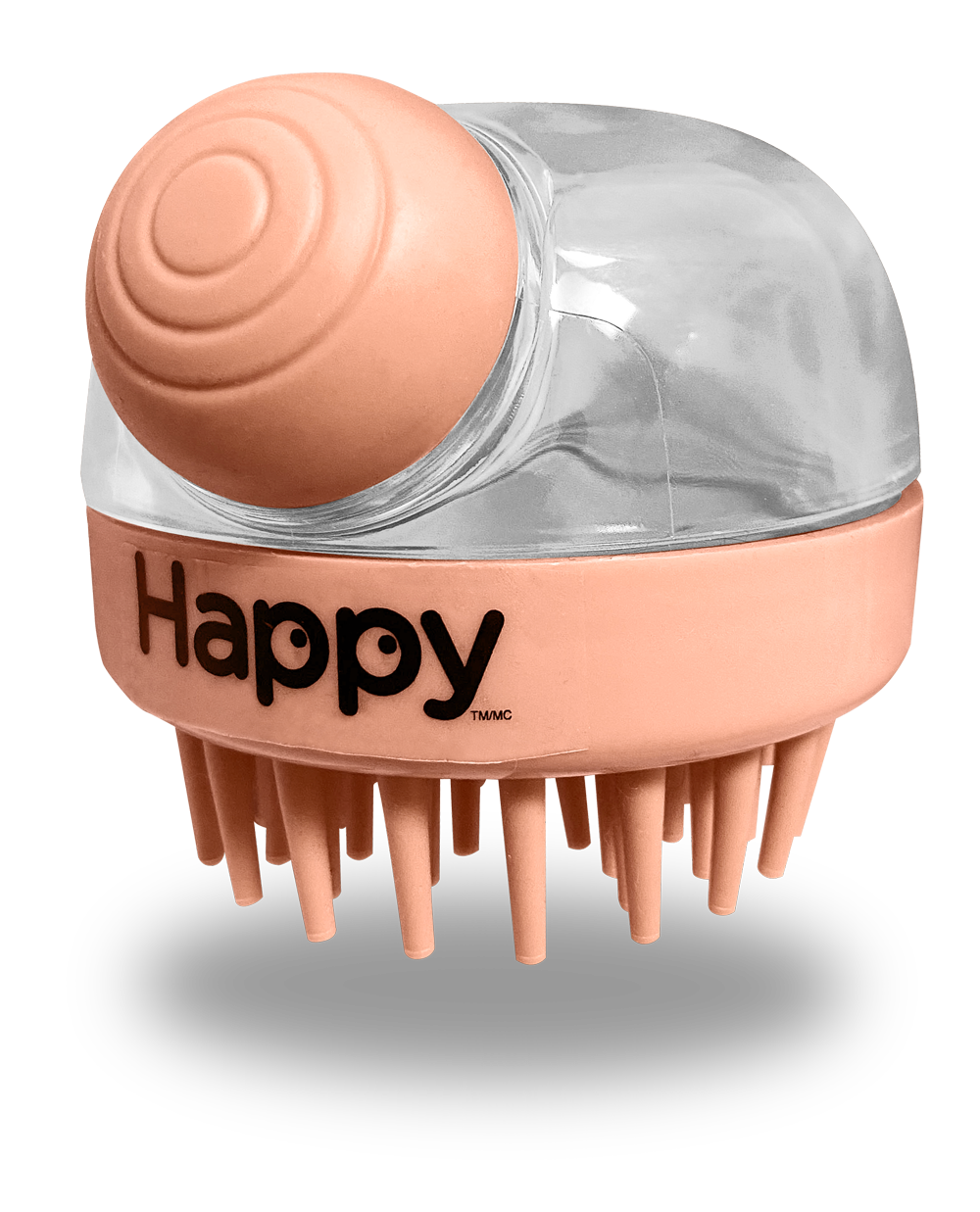

The Happy collection

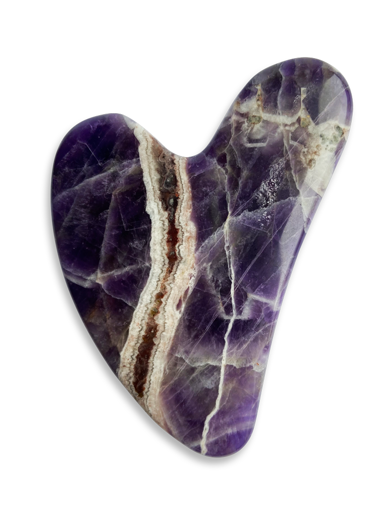
TRADTIONAL PRACTICES
Made for Today
Some of the best wellness practices aren’t trends. They’re traditions. At Happy Natural Products, we believe wellness is deeply personal. Inspired by time-honoured rituals passed through generations. From familiar ingredients to intentional moments of care, our products are designed to reconnect us in ways that feel meaningful today.
EXPLORE THE WORLD
TO BE INSPIRED
We are explorers, dreamers and makers. We travel the world in search of stories, lived experiences and transform them into beautifully designed essentials.
About
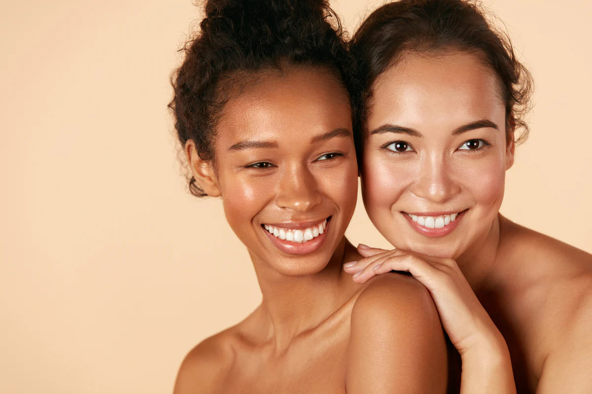
Our products
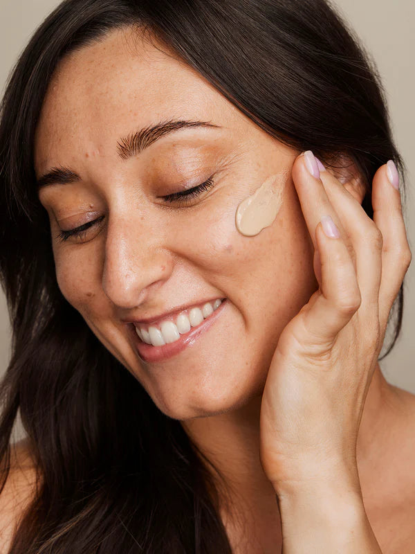
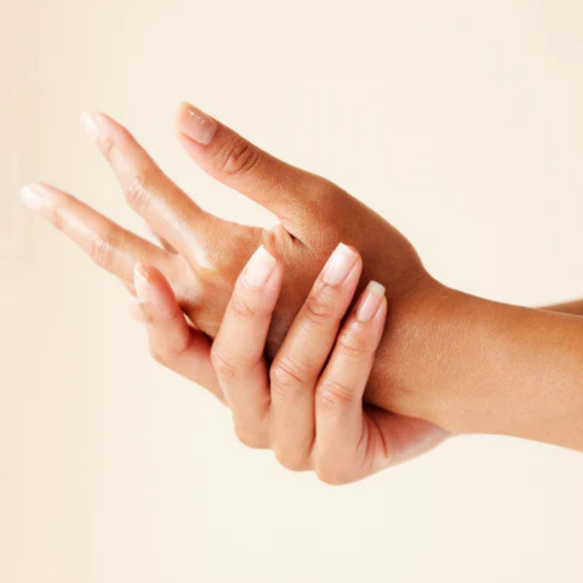
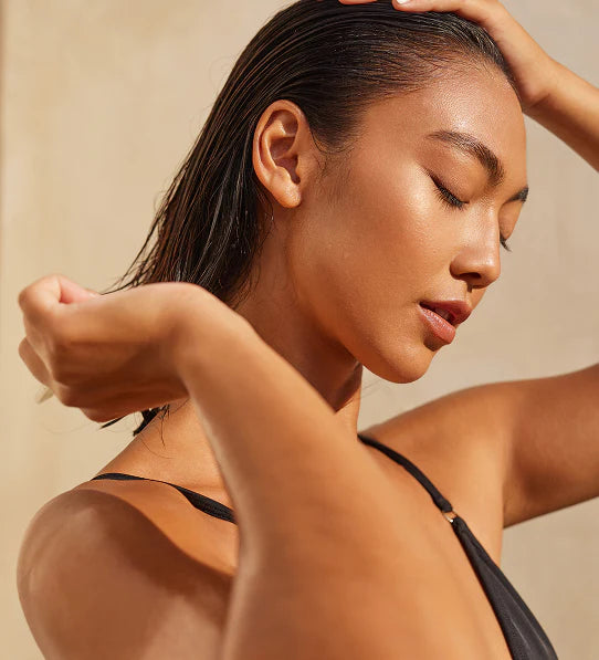
We create elevated personal care essentials that transform everyday routines into small moments of escape and intention.
Our collections span hand, lip, skin, and bath care. Each designed to feel both familiar and new, rooted in global inspiration.
Shop your set
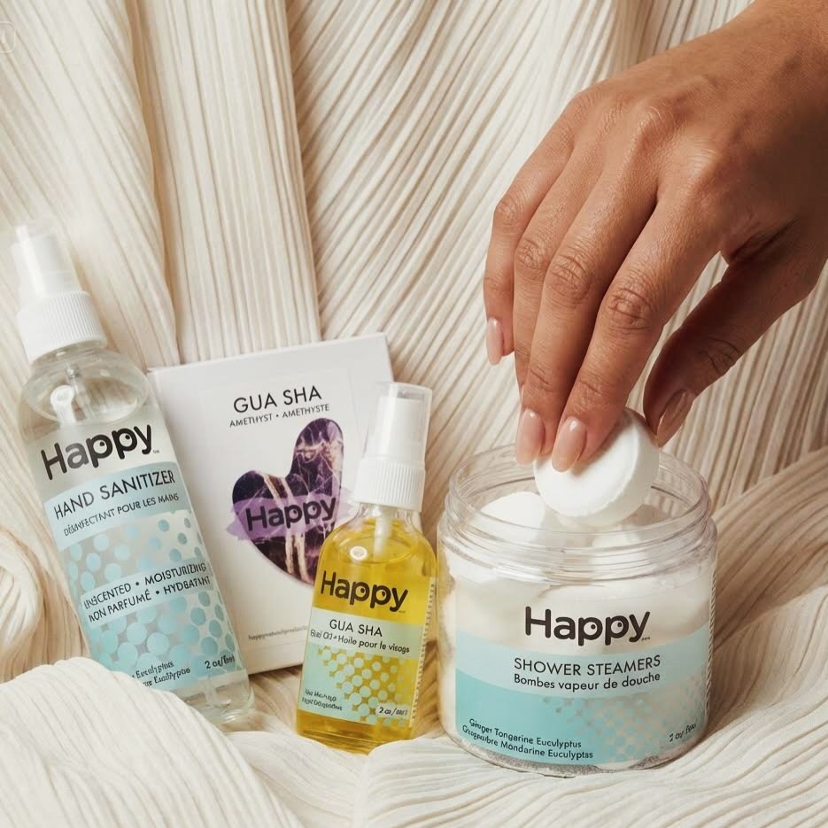
Shop the look
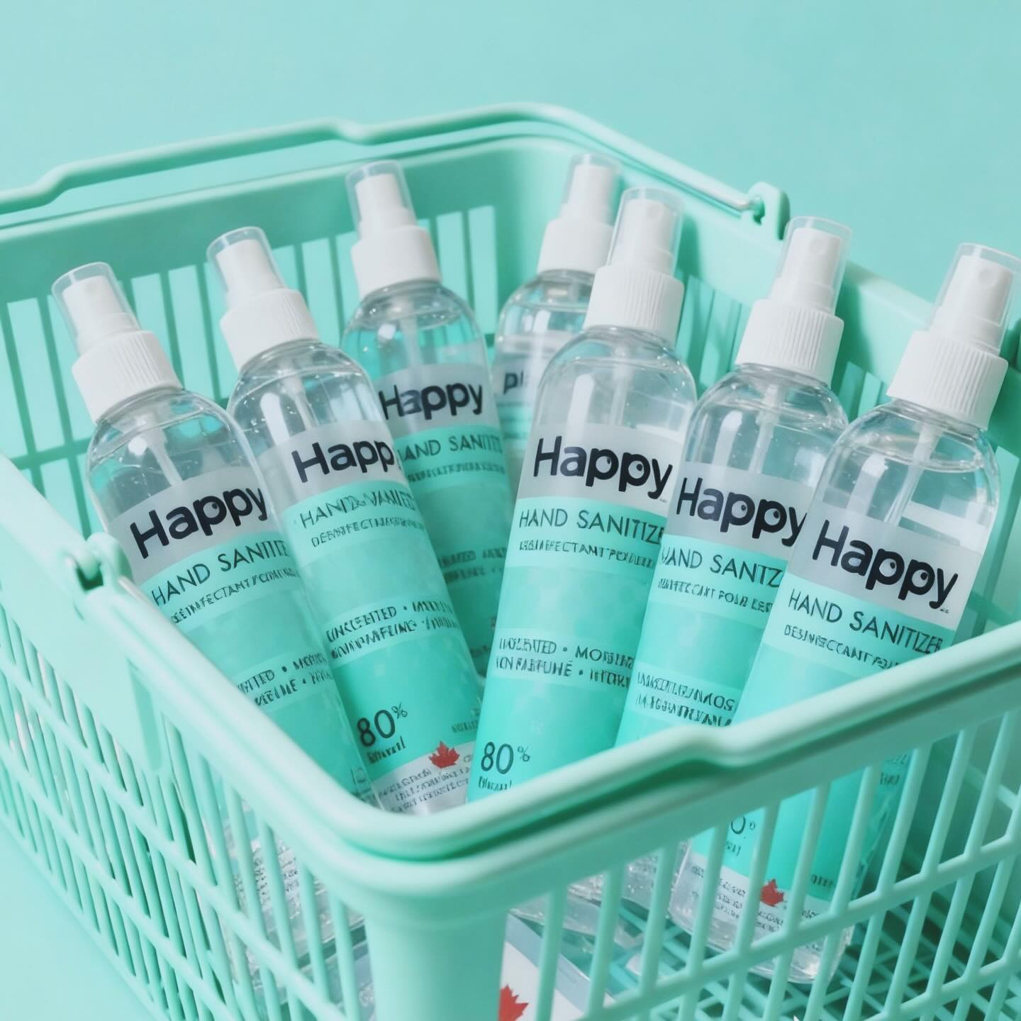
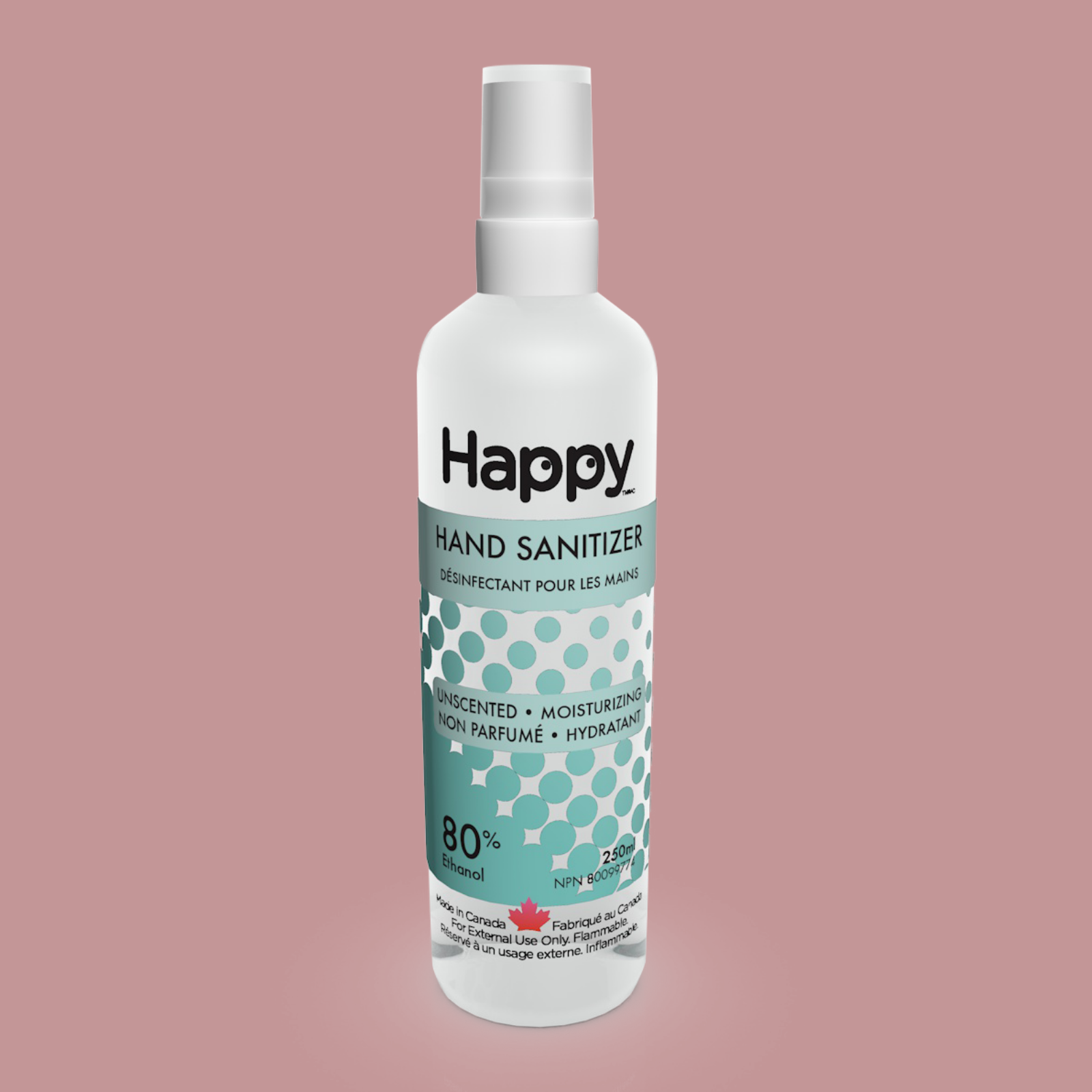
Love this sanitizer! Been using it for months and my hands are soft and moisturized. It dries quickly and leaves no scent behind. I keep a bottle in my handbag at all times.
Vivian | Customer
5 out of 5 stars.
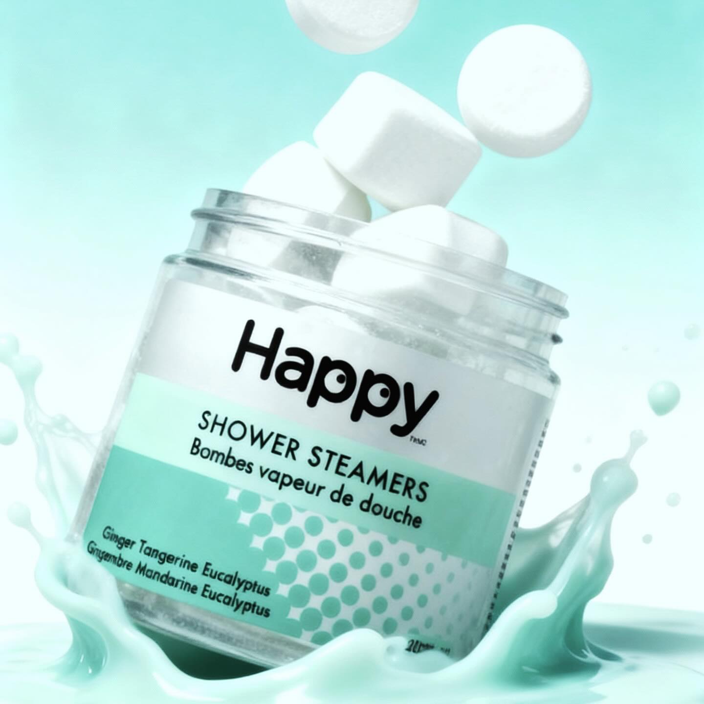
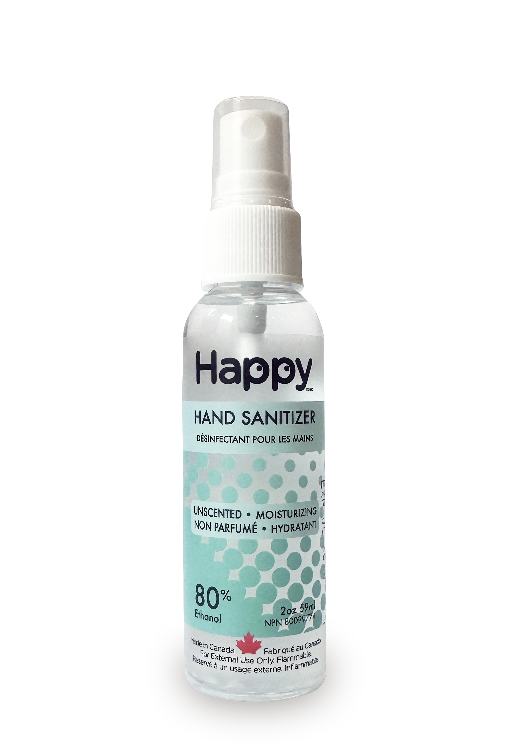
My favourite showers steamers (no gross synthetic scent)
Kelly | Customer
Keep me updated
Newsletter
follow us
@happy.naturalproducts